A population Profile is a graphical representation of an entire population, usually based on intervals of age regarding a variable. In the map above is a world census of male and female world population with Aids as the variable. As can be seen in the profile, the 20-25 population for males and females is the largest demographic age range for people with AIDS.
Sunday, August 3, 2008
Climograph
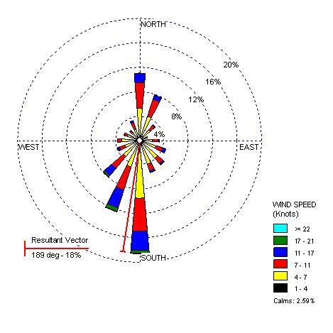
Windrose Plot
A windrose plot is a graphical representation of the windspeed and direction of the wind for an area. The above picture is from http://www.climate.washington.edu/windrose/Seattle-WindRose.jpg and shows the that in Seattle the wind Generally blew in a Southern direction with average speeds of 11-17 around 4% of the time. Total Southern winds were almost 20% of the wind pattern.
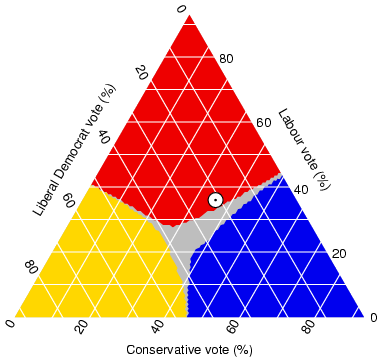
Triangular Plot
A triangular plot is done when three different variables are being measured with a set population not exceeding the triangular plot grid. The plot grid shown above is the percentage of the vote based on party in the British Parliament. This image was found at http://ex-parrot.com/~chris/images/20050407/triangle.png.
Parallel Coordinate Graph
A parallel Coordinate graph is a coordinate plot of different variables based on information and transferred into a graph to interpret the cross similarities in the variables. The map above found at http://www.palgrave-journals.com/ivs/journal/v6/n3/images/9500155f1.jpg shows a coordinate graph on the bottom on the image. The image is of Lung Cancer mortality rates and the amount of the population by county living under the poverty level.
Histograms
Histograms are used in mapping to show different levels of variables found within a geographic area. The image above is of soil levels and was found at http://soil.scijournals.org/content/vol70/issue3/images/large/920fig4.jpeg.
Isopleth Maps
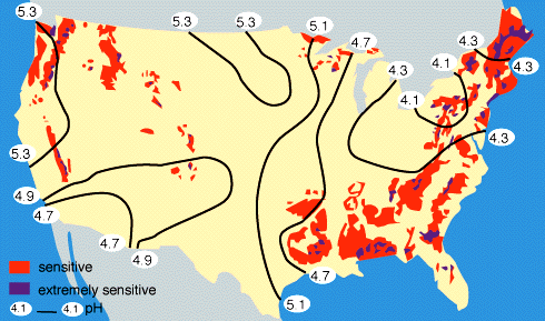
An isopleth map is a map that uses contour lines to show a distribution of equal values. There are many types of isopleth maps such as isobar, isoplat, isohyet, and many others. The above image is from the univesity of Michigan at http://www.globalchange.umich.edu/globalchange1/current/lectures/kling/water_nitro/USAacid_rain2.gif
and shows the levels of acidity in the United States.
Subscribe to:
Posts (Atom)