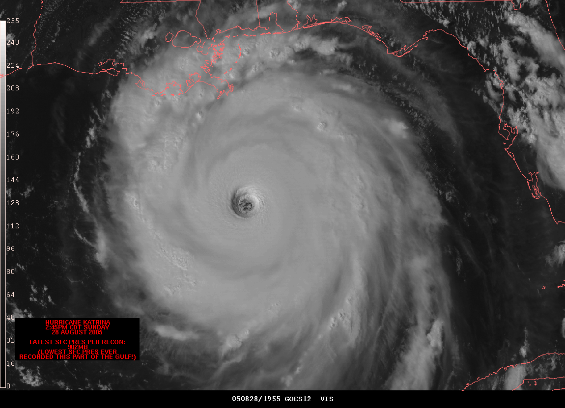
The animated map is a cartographic statement that occurs in time. Its interpretation is based on the human sensitivity to detect movement or change in a display. The image above is a still of an animation clip showing Hurricane Katrina making landfall. This image is from the NOAA website.
Sunday, August 3, 2008
Cartographic Animations
The animated map is a cartographic statement that occurs in time. Its interpretation is based on the human sensitivity to detect movement or change in a display. The image above is a still of an animation clip showing Hurricane Katrina making landfall. This image is from the NOAA website.
Statistical Map
A Statistical map provides statistical information in a graphic medium through color and shading to express changes in a variable. In the above picture the size of Napoleon's army is shown by the dwindling width of the lines of advance (green) and retreat (gold). The retreat information is correlated with a temperature scale shown along the lower portion of the map. Published by Charles Minard in 1869. This image was found on the Brittanica website.
Cartograms
Cartograms are maps that show the location of objects relative to a non-Euclidean variable such as population density or relative distance.
The (contiguous 48) states of the country are colored red or blue to indicate whether a majority of their voters voted for the Republican candidate (George W. Bush) or the Democratic candidate (John F. Kerry). This map was found off the University of Michigan Website.
Isohyet Map
Isohyets is an Isoline map that uses contour lines to show changes in precipitation. The above image was found at http://www.hko.gov.hk/publica/tc/tc2004/images/figure/figure332.gif and shows the precipitation levels of Hong Kong.
Flow Maps
Isoline Maps
Proportional Circle Map
Subscribe to:
Posts (Atom)