Sunday, August 3, 2008

KML remote sensing


Using Google Earth and teh 2007 weather satelite kml files, I pulled up an image of exactly where my home should be. Unfortunately the information is not up to date so nothing but a large field exists here. This is an example of aerial photography.

Classed Choropleth Map

A classed choropleth map has a legend with different equal intervals for ranges of the classes of data to be classified. The image above is of death rates for infants a year and under based on province in Australia.

Univariate choropleth maps

A Univariate choropleth map as above only shows information regarding one variable. In this map, the variable is population density for the New England Areas. The darker colors tend to be populated metropolitan areas.

Standardized Choropleth Map


This is a standardized choropleth map. As other chloropleth maps it is catogorized by a spatial boundary and it sorts the population by a percentage. In this map it shows the percentage of the Canadian Population age 14 and younger.

Bivariate choropleth maps


The above image is a bivariate choropleth map. A Bivariate map shows two different types of variables. This map above shows distance from the Mississippi River and number of confirmed cases of West Nile Virus.

Range graded proportional circle map

A Range graded proportional circle map is much like a chloropeth map except that instead of dots, we have a larger circle to show the larger proportion of the variable over a geographic area. In this map, we have census information for Canada.

DOQQ


DOQQ or Digital Orthophoto Quarter Quadrangle iimages are GIS images of aerial photos scanned into a computer with seams and angle displacements corrected. A DOQQ is a one meter pixel resolution that covers areas measuring 3.75-minutes longitude and latitude at a 1:12,000 scale. The above DOQQ is of Washington, D.C.

DEM


DEM or Digital Elevation Models are digital representation of ground surface topography or terrain. It is also widely known as a digital terrain model (DTM). DEM images are also used in 3D modeling or surface imaging GIS applications. The attached image is of the DEM of Honolulu, HI.

DLG


DLG or Digital Line Graphs are digital vector representations of cartographic information derived from USGS maps and related sources. DLG images are used in GIS applications. The above shown image is of Beaufort, SC.

DRG


DRG or Digital Raster Graphics are topographic maps from the United States Geological Survey (USGS) that are scanned into computers and used in GIS applications. The DRG image attached is of the western Washington D.C.

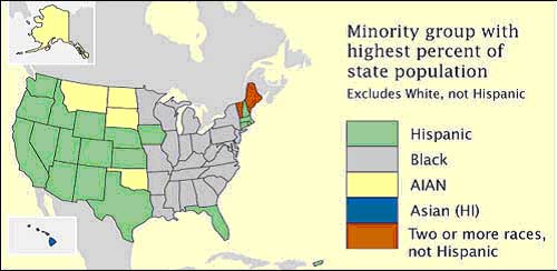
Nominal area choropleth map


A nominal area chloropleth map is a chloropleth map where the variables are not ordinal data, but merely nominal. In the above chloropleth map largest minority group representation is shown based on color for each state.

Bilateral graph


A bilateral graph is a graph that displays two variables on the same graph. Usually the two variables have some common relation. The attached graph from the ministry of commerce and Industry of the Government of India shows the import and export numbers in US dollars and also the total trade in US dollars. Since there are three numbers available on this chart it is technically a multilateral graph.

Lorenz Curve


A lorenz curve is a cumulative distribution curve along a possible distribution. Generally a Lorenz curve is used to show income disparity but can be used elsewhere as well. The image above is from the United Nations Development Program of Georgia and shows income distribution across several different years. The closer the curve gets to the diagnal curve line the more evenly distributed the variable is. In this representation one can see that since 1996 income distribution has balanced out greatly.

Index Value Plot


An index value plot is a plot field based around an index value that is determined. The image above from the USGS website shows the streamflow index in the United States over the last 45 days. 1 is considered dry, 7 considered very wet, and 4 is the average index value

Scatterplot


A scatterplot is a graph that uses vertical and horizontal coordinates to plot bivariable information. The information above represents max heart rate under stress and age. The information focuses around the age of 55 with a heartrate of 150.

Population Profile


A population Profile is a graphical representation of an entire population, usually based on intervals of age regarding a variable. In the map above is a world census of male and female world population with Aids as the variable. As can be seen in the profile, the 20-25 population for males and females is the largest demographic age range for people with AIDS.

Climograph


A climograph is a graphical representation of the a weather condition over an area throughout a period, (generally an annual graph). The above picture is a climograph of Cuiaba, Brazil showing the annual rainfall and climate.

Windrose Plot


A windrose plot is a graphical representation of the windspeed and direction of the wind for an area. The above picture is from http://www.climate.washington.edu/windrose/Seattle-WindRose.jpg and shows the that in Seattle the wind Generally blew in a Southern direction with average speeds of 11-17 around 4% of the time. Total Southern winds were almost 20% of the wind pattern.

Triangular Plot


A triangular plot is done when three different variables are being measured with a set population not exceeding the triangular plot grid. The plot grid shown above is the percentage of the vote based on party in the British Parliament. This image was found at http://ex-parrot.com/~chris/images/20050407/triangle.png.

Parallel Coordinate Graph


A parallel Coordinate graph is a coordinate plot of different variables based on information and transferred into a graph to interpret the cross similarities in the variables. The map above found at http://www.palgrave-journals.com/ivs/journal/v6/n3/images/9500155f1.jpg shows a coordinate graph on the bottom on the image. The image is of Lung Cancer mortality rates and the amount of the population by county living under the poverty level.

Histograms


Histograms are used in mapping to show different levels of variables found within a geographic area. The image above is of soil levels and was found at http://soil.scijournals.org/content/vol70/issue3/images/large/920fig4.jpeg.

Isopleth Maps


An isopleth map is a map that uses contour lines to show a distribution of equal values. There are many types of isopleth maps such as isobar, isoplat, isohyet, and many others. The above image is from the univesity of Michigan at http://www.globalchange.umich.edu/globalchange1/current/lectures/kling/water_nitro/USAacid_rain2.gif

and shows the levels of acidity in the United States.

Isoplat map


An isoplat map is a isoline map that uses contour lines to show variable changes of acidity in precipitation. This is an indicator of air pollution. The image above shows levels of acidity in the United States and was found on the United States Geology Society Website at http://pubs.usgs.gov/gip/acidrain/gifs/fig04.gif

Isobars


A line drawn on a weather map connecting points of equal pressure is called an isobar. The isobars are generated from mean sea level pressure reports and the pressure values are given in millibars. The image above of the Eastern united states was borrowed from the University of Illinois at Urbana's Website.


Isotach Map


Isotachs is an isoline map that shows different variables of wind speed. The above map shows the use of isotach lines on map of Indonesia to help predict the weather.

LIDAR

(Light Detection and Ranging, also known as Airborne Laser Swath Mapping or ALSM) - a technology that employs an airborne scanning laser. The above image is from NOAA is of the World Trade Center ground zero on September 27, 2001. LIDAR imaging can render topograhic areas dense in vegetation.


Doppler Radar


Doppler imaging is created by microwave signals sent from radar and changes in the frequency from the original transmission we can determine the amount of precipitation, and the direction of movement. The picture above from Weatherusa.net is an image of Hurricane Francis.

Black and white aerial photo

Black and White Aerial Photos were used in teh early part on the 20th century. This type of mapping is raster imaging. The image above from the New Zealand Electronic Text Centre shows part of the dock area at Dunkirk where the German invasion fleet was concentrated. Dock buildings round the upper of the two docks shown have been completely destroyed and unloading cranes smashed. Damaged barges can be seen near the entrance of the upper dock where a number of others have been sunk.

Infrared Aerial Photo


Infrared aerial photos are used to show an image on infrared film. This then provides a record of point to point variations in the temperature of the photograph. Not only can it be used to to show the changes that have taken place in our environments, but it can also be used to monitor such items as damage to roofs, the tracking of dairy farm out flows, pinpointing the source of, and monitoring, insect or disease infested vineyards, or sites contaminated by toxic chemicals, and many more applications.
The above image is an Infrared areial photo of the Middle Mississippi River taken in 1994.

Cartographic Animations


The animated map is a cartographic statement that occurs in time. Its interpretation is based on the human sensitivity to detect movement or change in a display. The image above is a still of an animation clip showing Hurricane Katrina making landfall. This image is from the NOAA website.

Statistical Map


A Statistical map provides statistical information in a graphic medium through color and shading to express changes in a variable. In the above picture the size of Napoleon's army is shown by the dwindling width of the lines of advance (green) and retreat (gold). The retreat information is correlated with a temperature scale shown along the lower portion of the map. Published by Charles Minard in 1869. This image was found on the Brittanica website.


Cartograms


Cartograms are maps that show the location of objects relative to a non-Euclidean variable such as population density or relative distance.

The (contiguous 48) states of the country are colored red or blue to indicate whether a majority of their voters voted for the Republican candidate (George W. Bush) or the Democratic candidate (John F. Kerry). This map was found off the University of Michigan Website.

Isohyet Map


Isohyets is an Isoline map that uses contour lines to show changes in precipitation. The above image was found at http://www.hko.gov.hk/publica/tc/tc2004/images/figure/figure332.gif and shows the precipitation levels of Hong Kong.

Flow Maps

The the map above is a flow map of traffic through the city of Renton, Washington in the year 2007. The map comes from the City of Renton Government website. Flow maps show data based on line thickness. Flow map lines can be drawn from one base map object to another, or you can associate a data file with a base map of curves to create a flow map.

Isoline Maps


Isoline maps are maps with contour lines that show change in a variable, height, depth, wind patterns, etc. The picture above borrowed from The San Francisco Estuary Institute shows the height values of a volcano.

Proportional Circle Map


A proportional circle map shows the difference in the amount of a variable based on the proportion of the circles. This map above borrowed from a class website at Northeastern Illinois University, shows the proportion of Mexican population in the Western united states circa 1990.