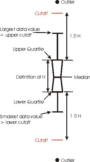
A Box Plot is usually a graph used to show the distribution of data. All data values are shown. The middle line represents the median; the left and right sides of the box show the medians of the lower and upper halves of the data. The ends of the line segments attached to the box extend to the smallest data value and the largest data value. The above picture is a box plot graph showing daily web hits to the SAS website.
Saturday, July 26, 2008
Stem and leaf plot
One way to make data more usable is to make a stem-and-leaf plot. The digit(s) in the greatest place value(s) of the data values are the stems. The digits in the next greatest place values are the leaves. For example, if all the data are two-digit numbers, the number in the tens place would be used for the stem. The number in the ones place would be used for the leaf. The above listed plot is of Infant Mortality rates in Western Africa. The image was founda at http://mainland.cctt.org/mathsummer/JosephBond/StemAndPlots
Similarity matrix
A similarity matrix is a matrix of scores which show the similarities between two data points. They are generally used in sequence. The higher the score the more similar characteristics it has. The similarity matrix above is of photo collections and exposure from the www.fxpal.com website.
Correlation Matrix
A Correlation matrix describes correlation among variables. It is a square symmetrical mapping that measures probability. The diagonal elements (correlations of variables with themselves) are always equal to 1.00. The above listed correlation matrix is a between types of organ systems and whether they are normal or cancerous and the correlation between normal or cancerous other organ systems.
Chloropleth Map
A chloropleth map is a that represents multiple variables within a subject or theme. Geographic areas or usually patterned or shaded to represent the different variables across the map. THe map above is from the USDA website and represents the amount of harvested acres of hay across the United States. The range of acreage determines the color pattern for that area.
Star Plot
The star plot is a method of displaying mutliple variables of information. Each star represents a single area or item. Star plots usually display many stars on each page and each star representing one area or item. In the above star plot crime rates for different cities are represented with each 'arm' of the star representing a different crime variable.
Dot Distribution Map
Propaganda Map
A propaganda map is a map that may have a political or otherwise motive behind it. Some Propaganda maps use scaling and line thickness while others may have symbols and pictures on them. The above picture is from approximately 1939 it is Japanese propaganda aiming to convince the Chinese that life would be better under their rule.
Hypsometric maps
Hypsometric maps are maps that show elevation. This is usually down through contouring and tint. The above linked map from the Kittias County Website shows the state of Washington through hypsometric tinting and contouring. The dark green areas being the lowest and the white areas being the highest, with everything else falling in between.
PLSS Map
The Public Land Survey System (PLSS) is a way parceling land in the United States. The PLSS typically divides land into 6-mile-square townships. Townships are subdivided into 36 one-mile- square sections. The department of the Interior regulates this surveying system. This image is from the Kitsap county government website and shows the PLSS parcelling on their county.
Cadastral Map
A cadastral map is a map showing boundaries, generally ownership values. Some of these maps contain GIS data on the map as well. Due to the functions of cadastral maps the scaling is generally very acurate. The picture above from the London Global University shows land parcel boundaries over an area of Campobasso, Italy.
Thematic Map
A thematic map provide spatial representions of different themes of data on a map. The above map is an example of a thematic map. This map represents positive and negative change in violent crime rates across the united states between 1978 and 1998. This map is from Steve Ford's personal website at http://www.geocities.com/stevejford/.
Topographic map
Planimetric Map
Subscribe to:
Posts (Atom)